Ghana is known for many things…but a country with thoughtful companies?
Better look elsewhere.
We don’t have those. OH NO!!! Not at all.
Some might say otherwise but as they say, “it only takes one bad nut to ruin the nut-sack”…or something like that.
PSST: at the end of this post, I’ll throw a challenge your way and hopefully you will take it on.
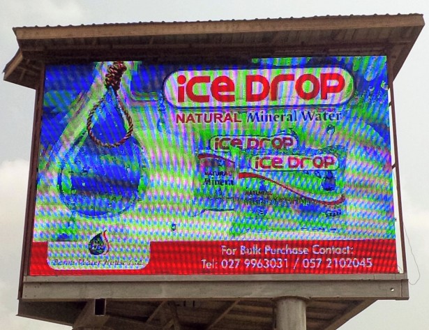
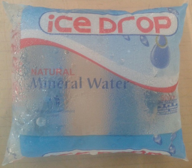
I would so love to shoot pebbles at all the incompetent companies and organizations in Ghana but today I want to focus on just one: Baron Water House Limited, the makers of the ICE DROP sachet water.
Few people might know this particular brand but a lot of Ghanaians (…and foreigners) are drinking it, without a care in the world.
To a large extent it’s not our fault; we’ve become desensitized with the over-abundance of sachet water currently on sale…to the point where we don’t check the labeling or if it has even been approved and stamped by the FDA.
We just drink away…because in the end, they are all the same to us.
Now to the few out there actually paying attention; I am sure you’ve noticed something extremely wrong with “ICE DROP” …and if after this ghastly discovery/realization you’re still drinking it, then…ummm…Godspeed.
ICE DROP is indeed unique but for the wrong reason.
Pickup an ICE DROP sachet water and you’ll notice the logo; a drop of water caught in a hangman’s noose.
At first glance, it looks rather interesting and if you switch your brain off, drinking the water would be the next step…but think about it a little more and the questions will start popping up;
why?
Why??
WHY???
Want a taste of moi?
Why a noose and a drop of water?
Why that imagery??
Why would any sane company even consider this as a logo for a consumable product???
Do they not know the symbolism attached to these elements?
Some elements shouldn’t even be seen in the same frame and I shudder to think of what possible reason they could have for placing water, the symbol of life, inside a noose, a symbol that carries with it decades of terror and intimidation…a tool for murder…an instrument of death…a symbol of pure unbridled racism.
Why oh why would a company do this?
Simple;
1. They have no focus groups.
2. The hamsters upstairs are obese from the lack of exercise and probably watching G-FORCE on infinite repeat.
3. Too stingy to actually contract a thinking artist/designer.
HEAR YE! HEAR YE! Just because something looks good doesn’t mean it’s acceptable…and besides, fusing some elements is a big “No No” in the design landscape.
But how can a company brazenly advertise and sell such a product without any known complaints?
Because the people drinking it aren’t aware or are just apathetic.
They drink it anyway because, “Hey pure water is pure water”.
Ghana is a very superstitious country but boy have we lost ourselves.
This post wants to create awareness so please let it.
If you know anyone even remotely associated with ICE DROP, ask them the meaning behind their logo: that’s my challenge to you.
If you get any info please let me know.
I’d like to know their dumb reasoning…and then blast them some more.
We need to send a message to all the companies out there;
“Think before you do anything!”
It’s time we make them accountable.
We have the rights, the choice and the money they so desperately need…let’s make them earn it.
PS: I’ve actually thought up meanings behind the ICE DROP logo and the best one I got was:
“Life from Death!”
Dumb right?
God please have mercy on Ghana.
PPS: Sorry for the terrible pictures. I took a shot at an electronic billboard…in a moving vehicle.
Will do better next time. 🙂

I’ve never even heard of this product, but I agree with you: That logo is absolutely bizarre!
Indeed it is.
Would you take a swig?
Very unlikely given its marketing!
Your life from death may be close – assuming they really thought this out. Associating a product with death/slash danger(excitement) can create an unconscious association . Implication that the product will help you escape death or cheat it ( the way tobacco product ads play with lifestyle and excitement), perhaps connecting to health concerns. http://ghanamedj.org/articles/June2007/Sachet%20water%20final.pdf
However, the execution (sorry, pun) of the advertisement is poorly expressed. It is as if it was designed in one language and then badly translated into another, like the odd advertisements/signs in English that show up in Asian countries. Curious to see how they would advertise cold cuts ( luncheon meats). 🙂
Great insight. You’ve done more brainwork for them and I think they should pay you.
Thanks and also thanks for dropping by my Implied Spaces blog.
Considering the topic of this post, you may find my blog on Media Literacy of interest.
https://darkpinesmedia.wordpress.com/
OK…I will pass by. 🙂
Ha Ha I love a rant and anyone..well almost who rants too 🙂
Thankyou for the ‘follow’ ….from a fellow ranter from across the globe it’s now a mutual …..LOVE your blog …..rant away brother:)
Thanks so much for the approval. 🙂
Your welcome ….look forward to reading more of your posts:)
It is a really bizarre kind of imagery used on the packet of a water-sachet. Why would a company do that? Is it subliminally warning the users of their products about something – that they have put something in the water sachet due to interference of some third party and it is not as safe as you think? Or are they so consumed in their arrogance that they are blatantly signifying that – you are tied to our drops of water like a noose around your neck? Or maybe, its just a badly thought out message about saving each drop of water?
Great post, by the way. You got a follower here!
Thanks. Thanks. Appreciate it. Welcome to the family.
I think this rope is suppose to signify strength. It is a well known fact that rope depending on the particular fibers(natural fibers in this case) gets stronger when wet. If you like you can google this science class type answer or you can ask a sailor, lol. Other than that I’m not sure why they would have used a rope for the ad. A lot of companies slip hidden messages in their logos and unless someone tells you exactly what it is you would be clueless. For years I didn’t see the arrow in the FedEx sign. Its literally right in front of your face. Until my friend told me to look closer and explained it was to signify that they are constantly moving I wouldn’t have seen it at all. Even if this rope doesn’t signify strength gained by the water you drink, I would like to keep thinking that was their intention. I find it hard to believe that they would intentionally post up a noose with intentions of being intensive to those who might relate it to slavery. I for one, didn’t think of slavery or feel offended by the sight of a noose but I can say it did take some brain work to figure out the best answer to the message.
You are correct, that IS bizarre. Any marketer worth their degree should know how much research should go into a logo…just as much as should go into the brand name! Good call, well deserved rant 🙂
Spend a day in my country and you’d wonder what makes the companies tick.
I believe you easily
When someone is hanged (as in executed) the space that their body falls into, swinging from the rope, is called “the drop.” So it’s clearly a macabre joke. They really need to redesign their logo!
Lool…that’s funny. Twisted but funny…though I doubt they planned that.
Hmmm… If you look it up, “drop” is the actual technical expression used when hanging someone! So I suspect they did plan it. Do you have capital punishment in Ghana by the way? We still have it on the books in Jamaica but no one has been hanged for many, many years…
OMG that is horrible marketing is very important and to have a hangman’s noose around the bag is suggesting they want to kill you. I’m sure this company is owned by caucasian people and if they were called out on this matter it would be the song they all sing when they get caught doing something… “I didn’t know this was racist”
Lool…they probably would.
I don’t come to this with the experience or history as you or the others here but at first glance I’d guess the noose simply represents ‘capturing clean water’ –like with a lasso (similar to a noose), and that it wasn’t intended to have any deeper meaning. Good blog. Found you on AOP Man…he brings people together doesn’t he?
hmmm…nice angle…but that rope looks less like a lasso.
AOP I love that guy.
Sick, kind of. But really, I wonder how the sales go (if at all).
Cheers! (this is obviously for your article, not the noose) 🙂
A lot of people are oblivious to the fact, so they buy it anyway.
its a shame really.
thanks for the read and compliment.
I thought I was the only one who’d noticed it. I just drove by one of their delivery trucks and because I was unable to take a photo of the logo, I decided to Google it. And viola! Here I am, I’m not alone. Great post.
Thank you for passing by.
Next time when you see em driving around, ask for the meaning behind the logo. Lol
Its amazing the kinds of logos and names people come up with for their band. Its pitiable to say the least. What’s even worse is that some of these brands are ‘so called big’ and well-known.
As consumers, it appears we have no say. We take what we are given.
I tell you
It is a shame.
And thanks very mich for following my blog.
thanks for stopping by. 🙂
I hope you enjoy what you find here.
This is extremely bizarre. Who is behind this company? I agree with petchary’s theory since drop is a word already associated with hanging people. It’s as if they just google searched for different meanings of drop to use in their logo and found one related to hanging. How is death an effective marketing tool? They should have just had a block of ice falling over a mountain onto somebody’s head. Me, I would be afraid to drink it.
Thanks for following me and helping me discover your blog. Love it!
I’ve called the company on occasion hoping for some insight into their logo design. Long story short, their higher-ups don’t even know what it means.
Such thoughtless approach confuses me.